Our Logo
The Meaning Behind Our Logo
Our Logo
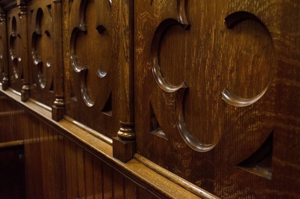
Our logo is based on one of the many symbols found throughout our sanctuary called the quatrefoil. Quatrefoil is the Anglicization of the French phrase “quatre feuille” which means “four leaves." This symbol of course is common in nature and became prominent feature of Gothic architecture. A symbol of good luck in the Celtic world, where it represented “the wheel of being,” the quatrefoil’s ancient tie between the natural and spiritual worlds is still recognized today in our enduring affinity for the four-leaf clover.
The Christian church adopted the quatrefoil in its earliest days in Celtic Britain. Over many centuries, it has come to represent the four evangelists, the four beasts of Ezekiel, the four horsemen of the Apocalypse and the four ends of the earth.
Most importantly for Christians, though, it represents the Cross – the central symbol of our faith. But it is a different sort of Cross, one that has no sharp external edges, no corners, no partitions or divisions. It has been described as a suggestive Cross, rather than an obvious Cross. Because it features four conjoined circles instead of two crossed sticks, it is a model of proportion and balance. It has been called an elegant cross. As such, it is symbolic of symmetry, harmony and wholeness, all beautiful fruits of the Christian life.

The four circles of this Cross represent God at the top, Christ and the Holy Spirit as its arms, and the Church at its foot. We are at its foot; yet we are an integral part of its design: God’s perfect plan.
In recent years, the quatrefoil has been described as a “green” Cross because of its abundance in the botanical world. In that sense, it reminds us, gently and with reassurance, that God is never separate from His created world.
The colors in our logo represent the colors of the liturgical year—blue for the hope and anticipation of the Advent season, white for purity used on the holiest days such as Christmas Eve, Christmas Day, and the season of Easter, purple for the season of repentance and preparation that precedes Easter, red for the power and presence of the Holy Spirit celebrated during Pentecost, and green signifying the growth of the kingdom of God.
For us at Centenary, the diversity of colors makes us think of our diversity as a congregation. At the center of the logo is the cross, where we all find our unity of identity and purpose. The logo reminds us not only of our unity in diversity, but also of our mission to proclaim the good news of God’s love and grace here in the city of Richmond and to the ends of the earth.
Like any symbol, this logo has many layers of meaning. We invite you to reflect on what this symbol says to you.

